When it comes to design projects the more you put in at the start the more you ge out at the end. What follows are a series of questions I have devised that should be put to clients before a project begins with the question I feel that are most important highlighted in red. This would usually be in the form of a brief. How ever these question shave not yet been broken down yet. As you can see the questions are not a linear process and certain questions affect other answers. My plan is to put these into a more effective brief for clients to make it faster for me to give them a quote, understand the project and weather it is worth pursuing.
Click Here to Read More..
Showing posts with label identity. Show all posts
Showing posts with label identity. Show all posts
Tuesday, 21 December 2010

Thursday, 12 August 2010
Save the British Film Industry Identity
This is a self initiated project based on a fiction brief for a real company. The aim as to produce an identity and promotional material for the cause and to raise awareness. I plan to submit the finalised materials to the company to see if they wish to use them for their identity.
Click Here to Read More..


Wednesday, 11 August 2010
Birmngham 64th Scout Group
My older sister is an honorary leader at her local scout group. The group decided to get some hoodies designed for the group that everyone could wear. However they needed an icon or logo to feature on the hooded tops. With me being in the right place at the right time I was able to provide my logo design services to them.
Brief: I was asked by my local scout group to design an icon to feature on their hooded tops. The icon must work against a black background and be suitable for embroidery. The hooded top will be worn by scout member while they are with scouts and they are out and about. A limited colour palette is advisable as printing cost can spike.
Research: I looked at the history of the scouts and the symbols that they have used such as the reef knot and the scouting portal as well as any potential icons I could use to symbolise birmingham.


Although it has not been requested these are some stationary mock-ups.
Tuesday, 10 August 2010
My Design Process
Below is my design process broken down into stages for you. I have done this to demystify the design process and so you can understand how extensive this process is. I believe it is a common misconception that designer can jump in front of the latest version of photoshop and begin designing immediately as this is not the case. Each stage has a brief explanation going over what this stage consists of so you as the client know what to expect.
Brief/
I will supply you with a template brief that can be found 'here'. The purpose of the brief is to ensure everyone involved in the project understands what to expect and by when. It also serves as a reference point for me as it will contain the important details such as the intend message, target audience and keywords. The brief will outline things such as; who you are/ what you do/ how you do it/ why/ target audience/ 'the message'/ project budget. All of these areas will need to be filled in thoroughly as possible. The more we put in here, the more we get out at the end.
I will supply you with a template brief that can be found 'here'. The purpose of the brief is to ensure everyone involved in the project understands what to expect and by when. It also serves as a reference point for me as it will contain the important details such as the intend message, target audience and keywords. The brief will outline things such as; who you are/ what you do/ how you do it/ why/ target audience/ 'the message'/ project budget. All of these areas will need to be filled in thoroughly as possible. The more we put in here, the more we get out at the end.

Agreement & Meeting/
Once I have received a brief I will send you a design agreement. I know many people get concerned when agreement gets involved in business, I know I used to. The purpose of the agreement is to protect ourselves and make sure we all know what to expect and by when, but it's okay, the agreement is negotiable and I often alter it for specific projects. I usually meet with the clients if this is possible, or relevant. If it is is a small project then a phone call or e-mail will suffice. I prefer to meet because I feel when people talk online some meaning is lost an their can be communication errors. Also t this stage we are tying to build trust an nothing will do this better than a face-to-face meeting. It is likely that we will have a few questioned for each other; me based and the brief and you based on my a my work. The agreement will cover things such as start & end date/ stages of design & payment/ design rights &confidentiality. The sooner we get the agreement & meeting out the way the sooner I can begin the research.

Research/
I will begin to research immediately. Some of this information I will get from the brief and through talking to you in the meeting. The research will also consist of me looking into your current brand, the history of your company, history of clients industry, what designs client do/ dont like, the future of your company, potential competition, marget/ industry trends, gaps in market/ industry, design trends, analysis, target audience, what sets you appart from the competition. The more in depth my research at this point the better the results will be in the next stage.

Brainstorm/ Idea generating/ Sketch/
This is where I begin brainstorming. I take the intended message and key points from the brief as well as the target audience and avoiding design trends into consideration. First I produce a brainstorm based on words. These words are used to spark images. I focus heavily on quality of ideas here over quantity though often enough plenty of ideas are generated.
This is where sketching begins. I focus heavily on quantity of ideas here trying go generate as many solutions as possible in the space of 15minutes then trying to beat it. I create a variety of logos including but not limited to; typographic, image only, combination of both, reversed out, silhouette, etc.

Prototype/ Mockups/
I will then whittle down the ideas to the best 10 and execute them using Adobe Illustrator. This may either involve sketching the brand mark and scanning it in or woking into Adobe Illustrator. These ideas are then put into context by presenting them in real scenarios; stationary/ multimedia/ display mock ups, print outs.

Client Review/
I will send you the designs as PDF document with several pages. The logo design will be presented in black and white/ greyscale. I do this because colour is subjective and will affect your interpretation of it. It is also important that logos work in black and white and do not really too heavily on color. (Colour should 'elevate' a logo not 'make' it.) At this point it is important that we focus on the form of the brand mark. Once the client has seen the logo they may with to take it as it is or make refinements. At this stage it is important that the client make these decisions based on brand values/ target audience/ the message beging conveyed/ where the brand mark will be.
Refinement/
I will then make the appropriate refinements specified by the client. Colour is then considered based on brand values/ target audience/ the message beging conveyed/ channels in wich the brand mark will be implemented.
Final Submission/
I submit the brand mark to the client in various formats, sizesblack and white/ grayscalce and full colour.
Additional Material/
If the client has requested Stationary/ Animation/ Motion Design/ posters/ leaflets/ flyers/ etc, then these will be executed with reference to all of the above.
Customer Service/
I am available to the client at any time to answer any design questions, give tips or advice as how best to implement the designs.
Thursday, 29 July 2010
Motion Graphics Identity
I have just made my first motion graphic identity for Omari McCarthy Design. Check it out here.
Click Here to Read More..
Click Here to Read More..
Wednesday, 9 June 2010
My First Business Cards
As I will have a press shoot at my 'Made in the Midlands' exhibition in Snow Hill train station from tomorrow I thought it would appropriate to get some business cards designed. There will be press there but I am unsure as to how many. I got 20 printed and below are photographs I have taken of them. This is part of a larger project called I_AM_THE_BRAND.
Business Card Mock Up

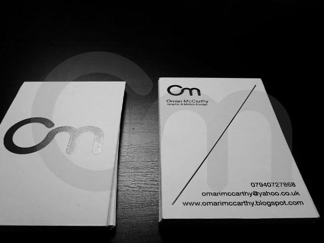


To see the full project 'Click Here'.
Friday, 21 May 2010
Final Major Project
The Brief:
Envy is a multidisciplinary graphic design studio that specialise in print, design and new media. We focus more on finding appropriate design solutions rather than applying a particular 'house' style to a brief. We pride ourself on our diversity and our work with clients from around the world. Create an identity for the graphic design company that specialise in print design and new media. Find an appropriate design solution for the following; logo, business card, letter head, invoice and posters an official website and blogspot, motion graphics identities and advertisements.
The deadline for this project is May 20th.
Research:
To begin with I pulled research from a wide range of sources from design books such as The Fundamentals of Graphics Design to online blogs such as logodesignlove.com to journals such as Computer Arts magazine and Creative Review. I knew from the very beginning I wanted to avoid design cliche's associated with design companies such as the use of the CMYK color palette, and ink splatter like images as a logo. I looked into the use of color in brand identities and the meaning of connotations in color of different countries and cultures as well as the most used color for corporate identity.
Ideas:
Because of the nature of the company I found myself heading towards a more typographic logo playing around with various ideas but not dismissing any to begin with. I eliminated any obvious ideas fist with my sketches such as the use of initials of images that symbolised envy or a green color palette. I needed somehting that could work across print, websites and motion graphics. This meant the logo would have to be simple and work just as well at 10 millimetres as it would at 10 meteres.
Logo Design:


Envy Style Guide:


Click Here to Read More..
Envy is a multidisciplinary graphic design studio that specialise in print, design and new media. We focus more on finding appropriate design solutions rather than applying a particular 'house' style to a brief. We pride ourself on our diversity and our work with clients from around the world. Create an identity for the graphic design company that specialise in print design and new media. Find an appropriate design solution for the following; logo, business card, letter head, invoice and posters an official website and blogspot, motion graphics identities and advertisements.
The deadline for this project is May 20th.
Research:
To begin with I pulled research from a wide range of sources from design books such as The Fundamentals of Graphics Design to online blogs such as logodesignlove.com to journals such as Computer Arts magazine and Creative Review. I knew from the very beginning I wanted to avoid design cliche's associated with design companies such as the use of the CMYK color palette, and ink splatter like images as a logo. I looked into the use of color in brand identities and the meaning of connotations in color of different countries and cultures as well as the most used color for corporate identity.
Ideas:
Because of the nature of the company I found myself heading towards a more typographic logo playing around with various ideas but not dismissing any to begin with. I eliminated any obvious ideas fist with my sketches such as the use of initials of images that symbolised envy or a green color palette. I needed somehting that could work across print, websites and motion graphics. This meant the logo would have to be simple and work just as well at 10 millimetres as it would at 10 meteres.
Logo Design:


Print Work:


Envy Style Guide:


Posters: Envy Design Principals


Online: Official Website & Blogspot


Final Major Project Exhibition:


Grade Predicted: Distinction
Grade Achieved: Distinction
Evaluation:
I feel this is one of my most challenging, productive and most beneficial project I have ever worked on. By getting out of my comfort zones and exploring new media I have a better understanding of a few areas of design such as branding and identity (as well as the diference between the two), web, motion graphics and preparing work for print. I have also learnt that there is no better way to lear something than under the looming pressure of a tight deadline; such as Dreamweaver, very basic CSS and animating in After Effects.
After doing the art and design foundation course I have realised the course has not befitted me directly, but deep down inside I know if I had progressed strait onto a degree course not only would it have been in a course such as illustration I would also not be ready for the standards of work, presentation and time limits. The course has benefitted my by giving me a year to experiment and decide what I really want to do; Digital Animation at Falmouth University. I have found a love of logo design that I think I will peruse by attempting to brand myself very soon. This has been an an enjoyable course, project and I look forward to more in the future.
Subscribe to:
Posts (Atom)