Showing posts with label graphic design. Show all posts

Saturday, 1 October 2011

Flex 2011 Redesign Complete


You can see the full design process 'here'


Click Here to Read More..

Wednesday, 31 August 2011

Flex Re-Design: Freshers Guide

On of the articles in the Freshers Guide is called '10 Things To Do Before SecondYear' by Hollie Anderson. I asked if I could see the articles before it was proofed so I could get an idea of what I have to work with. I will also be doing with for the other sections too.


After reading the article I felt that it would lend itself well to a poster quality approach. As you scroll down you will be able to see how the design has developed. I plan to experiment with illustration for maybe 5 of the 10 'things' and upload this later. But i personally feel that the last one, the most simple is the best and will continue to develop this.


Click Here to Read More..

Saturday, 27 August 2011

Flex Re-Design: Lifestyle Section

Today I decided to take a shot at the lifestyle section. Photography will play a large part in this section and is ideally at the forefront of the writer and editors mine. The only catch is that Flex has had consistently poor not to mention low resolution images. I want to take much more of a magazine approach to lifestyle as I feel it would lend itself well. Text-over-image is something I have been discussing with Henry but I will also need to run it by the printer. I would like to get the editors confident enough in letting us run full page, full bleed high resolution photos. Below is what I have in mind for lifestyle.


Click Here to Read More..

Wednesday, 17 August 2011

Flex ReDesign Progress

Over the summer me and the Flex Design Team began redesign the student newspaper. Just to remind that the work you will see from Flex posted here has been a team effort and could not have been done without them, the editor and our new but small marketing team. Below is a sample of that design. We began by looking at typography and grid systems. The 12x12 grid was chose because fo the flexibility of use for a grid. It can be used at 6, 3, 4 or even an off number of columns for white space. Being  newspaper we felt this was the best option.


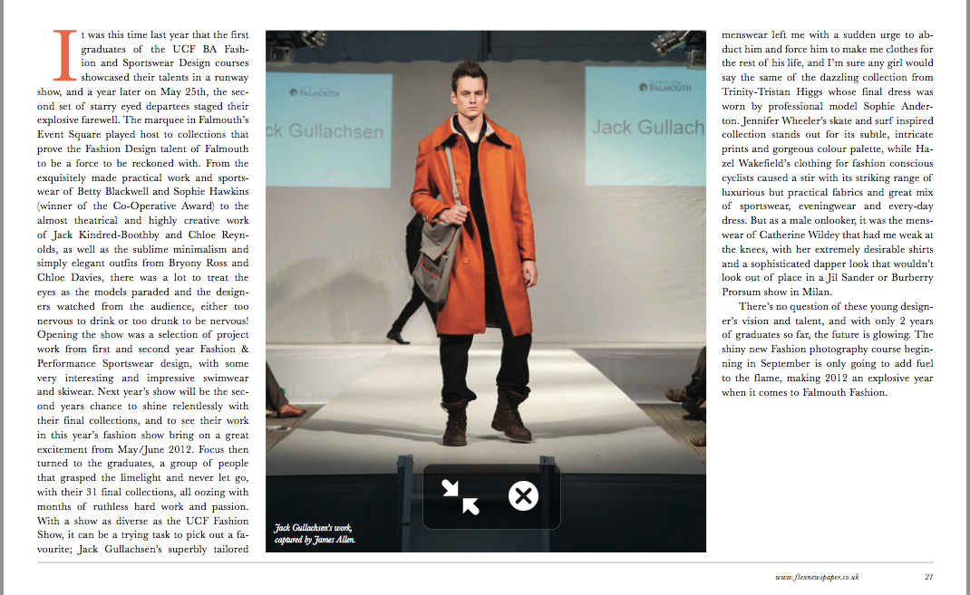
I have decided on some general rules for design and layout.
1) Establish a visual hierarchy:  Every page is structured from top left to bottom right. Important articles are placed in the top left, the less important ones are placed in the bottom right. Don't use the same headline point size for each article, it must vary.
2) Big pictures, big info graphics, use the strength of the paper medium (the photography is dependant on the story so this may not always be possible.)
3) The center fold should be like a poster and fill the field of vision. The centerfold should be so nice that you want to take it out and hang it on the wall. (I have begun to develop some info-graphics to go in the centre pages and online.)

12x 12 grid for Flexibility, 10mm Margins, 5mm Gutter.
Visual Hierarchy test

When it comes to typography we new the old Mercury and Ziggurat typefaces had to go as they did nothing for the publication. We wanted a much stronger serif/ sans-serif mix. We all settled on Baskerville, designed by John Baskerville in 1757, for body copy, pull quotes and captions quite easily. It was chosen because of its good legibility as a result of the difference between the thick and thin parts of the letterforms. We have used slightly looser leading; Baskerville will be sued at 9pt on 12pt leading where as Mercury G1 was used at 8.7pt on 12pt leading but when you realise Baskerville has a smaller 'x height' we wend up with looser leading making any long runs of copy look softer in tone and easier on the eyes.
Baskerville Regular for Body Copy. 

Baskerville Test

The headlines were not that easily decided. We put forward font such as Gotham and Futura but found although they work alone they did not have what it takes to be a headline. When Knockout came into the picture we experimented with several weights and were eventually able to settle on it.


Knockout: Headlines

Knockout Test

We have been talking with the editor about changes in production, distribution and design over the summer. It looks like the future of the paper will be exciting. I would also like to send it to Its Nice That magazine as well as a few others to see if we can get featured and some exposure. For now the deadline is fast approaching and there are still a lot of changes to be made as well as the looming Freshers Issue deadline. Keep an eye out for the full redesign at the start of September.

Click Here to Read More..

Monday, 9 May 2011

Flex: Student Newspaper Issue 19


This term the design team says farewell to Rachel Maria Smith our regular Lifestyle section designer who is leaving the paper since being with us from the start of 1st year. She has done a great job and being a Designer for one of the UK's few student newspaper will look very impressive to employers on her CV. We are still looking for a new designer to take up the mantle. If you know anyone then tell them to get in touch with directly.


Despite our loss I feel this is the first issue of Flex that has been published after easter. I feel it is one of our best covers yet, something which we all need to put more time in. As you know I am Head of Design for the paper a role which involves working closely with the editors to achieve a quality and timely publication, managing a design team of of now 5; Mo, Nadya, Guro, Henry, Lou, designing a providing feedback on various designs, ensuring consistency across the publication, pre-press and enduring the printer gets the files on time.

There are only three issues for this final term so they should not conflict too much with course work and if they do it usually means I am up until about 3am on a Thursday night/ Friday morning with the printer screaming at me. (No, I kid. he does not scream he always seems very calm, I am the one who gets stressed.)


Next year there will be a new team of editors who are currently shadowing the 2nd year editors. I plan to arrange a meeting with them an improve the relationship between writers/ editors and the design team. Its will only the make the paper stronger. I have also had a few ideas about launching an online magazine to run a long side the paper. But i'll save that for another post.


Click Here to Read More..

Monday, 24 January 2011

Safety Focus Magazine Re-design/

I saw an advertisement in a student newsletter about working on magazine for Africa. Although this was a little vague I had plans in the future of etting up my own magazine so getting some experience would be useful. Although I had already begin working on Flex the student newspaper it would just be case of careful time managent to get it done. However this was only my first term and I was involved in too many things to give the magazine the attention it required.

Click Here to Read More..

Tuesday, 21 December 2010

Research/

When it comes to design projects the more you put in at the start the more you ge out at the end. What follows are a series of questions I have devised that should be put to clients before a project begins with the question I feel that are most important highlighted in red. This would usually be in the form of a brief. How ever these question shave not yet been broken down yet. As you can see the questions are not a linear process and certain questions affect other answers. My plan is to put these into a more effective brief for clients to make it faster for me to give them a quote, understand the project and weather it is worth pursuing. 
Click Here to Read More..

Monday, 29 November 2010

Flex: Student Newspaper Issue 13/

Now that i had some previous experience working on the paper I knew that we could do better this time. After having a meeting with the editors we proposed that there was much are feedback between the designers of and editors of each section

The team for this issue was Me, Morwenna, Rachel, Nadya, Lou, Henry and Guro For this issue below I had to put together Sports and heavily alter another section as well put in a lod of last minute adverts and prepare the paper for the printer. The cover was designed by Guro.

This issue the paper was much better. There were only issues with names of certain sections of the articles. To counter this I have made myself a strict checklist to run through before sending the paper off to print. One of the strength of this issue was in the process; the idea of having more feedback between the editors and design team made the work much smoother and meant I had to do much less tweaking in the end. I hope next issue there will be zero mistakes as it will be the final issue before the christmas break.


Click Here to Read More..

Sunday, 22 August 2010

Poster Ideas

In my spare time I enjoy designing posters. You know when you get those quick ideas that come to your head. I always think to myself 'that would be such a good idea for poster'! Below are two posters I designed recently; 'Whats give you the right', is a poster about opinions on design. 'A4 is a Bore', is a poster making a joke about the constraints of the generic A4 paper and my attempt to break free from it.


Click Here to Read More..

Thursday, 12 August 2010

Save the British Film Industry Identity

This is a self initiated project based on a fiction brief for a real company.  The aim as to produce an identity and promotional material for the cause and to raise awareness. I plan to submit the finalised materials to the company to see if they wish to use them for their identity.


To see the full project please 'click here'


Click Here to Read More..

Wednesday, 11 August 2010

Birmngham 64th Scout Group

My older sister is an honorary leader at her local scout group. The group decided to get some hoodies designed for the group that everyone could wear. However they needed an icon or logo to feature on the hooded tops. With me being in the right place at the right time I was able to provide my logo design services to them.

Brief: I was asked by my local scout group to design an icon to feature on their hooded tops. The icon must work against a black background and be suitable for embroidery. The hooded top will be worn by scout member while they are with scouts and they are out and about. A limited colour palette is advisable as printing cost can spike.

Research: I looked at the history of the scouts and the symbols that they have used such as the reef knot and the scouting portal as well as any potential icons I could use to symbolise birmingham.


Although it has not been requested these are some stationary mock-ups.


Click Here to Read More..