Brief:
Create an identity and cross media promotional material for 'Save the British Film Industry' to help raise awareness or the organisation. After the cut of the UK Film council the organisation needs to build trust, honest, and convey they want to 'save British film'. The audience for this is very broad stemming from the public the council and to parliament.
Create an identity and cross media promotional material for 'Save the British Film Industry' to help raise awareness or the organisation. After the cut of the UK Film council the organisation needs to build trust, honest, and convey they want to 'save British film'. The audience for this is very broad stemming from the public the council and to parliament.
Research:
I began by looking on their current website and trying to understand the cause further. I could see many different ways in witch their cause could be broken down and understood. Once I understood the
organizations history and its future I began by looking at the identity design of film councils and film related organizations and began to pick apart and critique them well as logo design trends in 2010.
Ideas:
I had to keep in mind that the target audience was broad and the identity would be used across many different channels. Avoid clichés; trends and the competition but still convey what was intended in the brief.
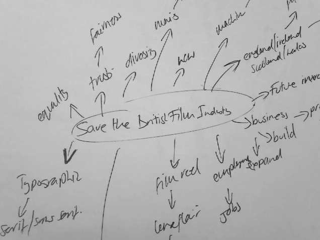

Because of the length of the company name it needed an icon to take its place where the typographical version would be unsuitable. I decided to use the 'claperboard' as the stand alone symbol for Save The British Film Industry. The clapboard is used to co-ordinate the sound with the footage. A silhouetted form has been used for the purpose of simplicity but it is still a recognizable form and have more power than a detailed version. The way the icon seems to be closing itself reflects an end but the use of the claperboard at the start of filming reflects the beginning. Its is also marked with the number of takes being filmed making the editors job easier. The claperboard symbolises organisation, unity, direction, action, and the beginning of something new. All of these things reflect the brand.

This is the vector version of the logo I created in Illustrator.

I made sure the logo would work in black and white as a precaution.
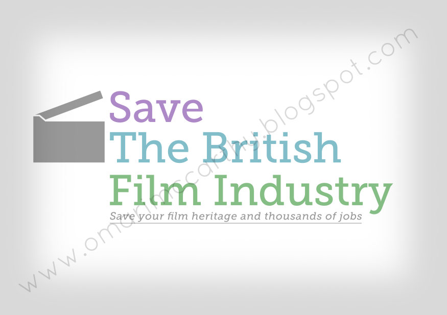
This is the final version of the logo with the brand colours applied. The benefit of using a typographical logo is that it can work in as small a size as type can work making it more versatile.

I chose to use a font called Museo for this brand. This is because of its elegance and presence. The colours that were chosen were carefully considered. Museo is a serif font that has distinctive features of certain letters such as the 'M', 'U', 'S' and 'F' among others. Its decorative edges contrast nicely with the sharp corners of the icon.
The colours here were also careful considered based on the brief, audience and channels being used. The brief needed to convey trust, honesty, progression. I have used slightly desaturated colours as the highly saturated hues were too bright and distracted from what the logo was about.
Purple: power, status, etc.
Green: natural, familiarity, etc.
Blue: honesty, trust, purity, etc.
Green and blue are facility colours that are both in nature and are used through out our life, however purple alludes to something new. The colours together represent; change, diversity, difference, progress. The use of the contrast of colour between the grey icon and the colour of the text again alludes to change and progression.

Designs for stationary; business card, letter head, invoice and compliment slip. Consistency is key across the entire brand.


From the information I received I decided to break it all down to form of information that could be understood. I realised I could break down the organisations solution into 'Build', 'Expand' and 'Preserve'. I decided to have each of these represented by colour that could work well across the whole identity as well as shape wish allowed me to use shape to convey an idea and emotion. After some research into shape I settled on square, circle and triangle.
All three shapes convey equality, familiarity and safety because they are commonly used geometric shapes.
Square: honesty, stability, equality, comfort, safety, familiarity, etc.
Circle: completeness, progression, infinity, continuity, equality, protectiveness, global, etc.
Triangle: stability, strength, continuity, equality, action, dynamism, symmetry, movement, progression, etc.


This is a photoshop mock up of the website I would have created. However I am still learning. Here I focused on the fundamentals of design and usability.


(animation/motion graphics: in progress...)