Brief: I gave them a template brief to fill out and they e-mailed it back to me. This is not an exact quote but essentially the brief was: we need a logo help build our brand identity, show the world the service we provide, reflect out cire values (re-inventing dyslexia), be easily recognized. The logo will need to be suitable for all communication; stationary, website and social media.
Research: Once I had fully absorbed myself in the brief I would get into the research which would include; what is dyslexia, designing for dyslexia color/ font/ size, critique of competition/ rival logos, logo design trends. Along with this a few logo design blogs came in hands such as Just Creative Design and David Airey as well as books about color, and semiotics.
Ideas: I had not sketched out any ideas at this point. This was because I had arranged to meet my clients because I believe face to face interactions is very important for projects such as these. In the meeting I presented them with a contract agreement and began to discuss the stages of the projects, my price as well as payment.
The meeting did not go as well as I had planned but I could see its benefit immediately. I we had not met at this point the entire project could have in jeopardy. This was because of communications issues that occurred earlier on in the projects. The client made it clear they only wanted me to execute their logo design with the idea of a backwards 'D' and forward 'B' next to each other. The amount of research I had done had been slightly irrelevant as they have a completely new take on dyslexia itself, the content of the agreement and price also had to be altered. I left the meeting feeling as though I had not done my job professionally but I soon realised it is best that I made these mistakes now and learn from them for future projects.
BrainStorm: When I brainstorm and sketched for this part of the project I kept in mind what the were about and what they wanted to convey to their audience. Having them show me what they wanted made the design easier but can sometimes having a lack of creative input and stunt creative output. They said the logo had to include "re-inventing dyslexia" at the top and their website at the bottom, preferably curved around the logo.


...........
I presented my clients with 6 variations of the logo design as we agreed. These variations were submitted in black and white because color is subjective and would alter their perceptions of the logo. At this point it is important that we focus on the shape and meaning rather than color. The clients saw the below designs as a good start point but wanted develop some further.

..........

.............
...........
Green: relaxing > nature > spring> ('re-inventing') >
Orange: warm > calming > vibrant >
Blue: cool > water> replenishing > ('re-inventing') >

............

I then submitted what I though would be the final version of the logo. However the client wanted several things to be changed. Color/ size of text, width of logo, and shade of green.

Final Logo:

When possible the colour version should always appear as above with the green to yellow gradient. However in situations where colour can not be used some solutions are more acceptable than others. The logos is to appear in black and white it will appear as a solid black with white highlights. The outline of the logo must also be solid black. The highlights must never be transparent, only solid white. A greyscale or black to white gradient is never to be used in the reproduction of the logo.
The logo has been designed to be reproduced at a minimum size of 30mm with text and 15mm with out text. This is because the smaller the sized affect the legibility of the text.


..............
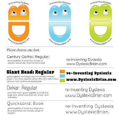
Although I was not requested to decide on a font if I were the below font would have been used. This is because is has good legibility and small and large sized, looks professional without being to serious, sans serif does not impede legibility, has a range of weights.

Century Gothic will be substituted for Ariel for all online communications.
.............

Although it was not requested this is the stationary design I would have supplied had they been. Business cards, letter head, compliment slip, envelope. Staying true to the idea of 're-inventing' dyslexia I experimented with the idea a of a sort of jigsaw puzzle in wich all the stationary would come together to reveal the logo.
.............
Evaluation:
Being my very first commission I feel this project has benefitted me greatly. There is no better way to learn something than on the actual job. Dealing with clients, writing briefs and negotiating contracts are not things that can be formally taught. Having a head start is only going to do me a world of good. It has been challenging and a massive learning curve but I am extremely grateful to Dyslexic Brian for allowing me to design a logo as it has been an experience.
Client Testimonial:
" "
Antonio & Goga Co Founder of Dyslexic Brian
External ink to site: