Over the summer me and the Flex Design Team began redesign the student newspaper. Just to remind that the work you will see from Flex posted here has been a team effort and could not have been done without them, the editor and our new but small marketing team. Below is a sample of that design. We began by looking at typography and grid systems. The 12x12 grid was chose because fo the flexibility of use for a grid. It can be used at 6, 3, 4 or even an off number of columns for white space. Being newspaper we felt this was the best option.
I have decided on some general rules for design and layout.
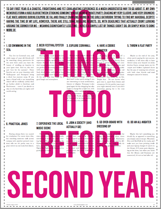
1) Establish a visual hierarchy: Every page is structured from top
left to bottom right. Important articles are placed in the top left, the less important ones are placed in the bottom right. Don't use the same headline point size for each article, it must vary.
2) Big pictures, big info graphics, use the
strength of the paper medium (the photography is dependant on the story so this may not always be possible.)
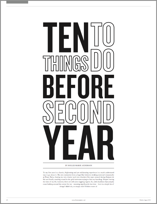
3) The center fold
should be like a poster and fill the field of vision. The centerfold should be so nice that you want to
take it out and hang it on the wall. (I have begun to develop some info-graphics to go in the centre pages and online.)
 |
| 12x 12 grid for Flexibility, 10mm Margins, 5mm Gutter. |
 |
| Visual Hierarchy test |
When it comes to typography we new the old Mercury and Ziggurat typefaces had to go as they did nothing for the publication. We wanted a much stronger serif/ sans-serif mix. We all settled on Baskerville, designed by John Baskerville in 1757, for body copy, pull quotes and captions quite easily. It was chosen because of its good legibility as a result of the difference between the thick and thin parts of the letterforms. We have used slightly looser leading; Baskerville will be sued at 9pt on 12pt leading where as Mercury G1 was used at 8.7pt on 12pt leading but when you realise Baskerville has a smaller 'x height' we wend up with looser leading making any long runs of copy look softer in tone and easier on the eyes.
 |
| Baskerville Regular for Body Copy. |
 |
| Baskerville Test |
The headlines were not that easily decided. We put forward font such as Gotham and Futura but found although they work alone they did not have what it takes to be a headline. When Knockout came into the picture we experimented with several weights and were eventually able to settle on it.
 |
| Knockout: Headlines |
 |
| Knockout Test |
We have been talking with the editor about changes in production, distribution and design over the summer. It looks like the future of the paper will be exciting. I would also like to send it to Its Nice That magazine as well as a few others to see if we can get featured and some exposure. For now the deadline is fast approaching and there are still a lot of changes to be made as well as the looming Freshers Issue deadline. Keep an eye out for the full redesign at the start of September.
Click Here to Read More..